Wednesday, 26 March 2014

2nd "Love Hearts" piece

My second "Love Hearts" piece is a decorative wooden board, similar in style to those that are currently "on trend", but with a completely different message:


I chose to use pastel colours and the heart shape in keeping with my research into Love Hearts and colour theory, but like my slogan underwear, the messages are handwritten and the colour is hand painted.

This gives a "human" feel to a type of decoration that is often mass produced by machines and sold in bulk, but is in keeping with the vintage style of other decorations.

Thursday, 20 March 2014

"Love Hearts" slogan decoration

There is currently a trend for "vintage chic" home decor, with old-fashioned looking posters and other decorations becoming more and more popular. However, many of them are of a style that apparently epitomises vintage living, but actually glorifies the idea of "women's work" and shows women as being second rate, far more than is socially acceptable today:

"Laundry service" sign, eBay

"Sarcasm" apron, B&M

"Better rich" lap tray, B&M

"Definition of a girl" hanging sign, notonthehighstreet.com


Whilst these objects might be intended to be funny or "just a joke", many of them feature very sexist slogans.

Thursday, 13 March 2014

Slogans/"Love Hearts"

I chose to appropriate Love Hearts in my work, to make a comment about feminism and equality and how these kinds of objects are aimed at/about women. I painted a set of canvases in the same style as the sweets, but instead of being edible they can be used as decorations, in order to make a statement. They also feature sarcastic messages instead of the "cute", kitsch ones on the sweets:


Friday, 7 March 2014

"Love hearts" and slogans

Slogans are not just found on clothing, they are also used on many other objects to convey messages. Using "feminine" pastel colours in my slogan underwear pieces made me think of Love Hearts:


The iconic sweets are also various pastel colours, and feature slogans printed on them:

"There are many different messages which can be found on the front of the sweet, most of which are love-related. The message is written in capitals in a sans serif font of varying size. The font is scaled and sometimes stretched out of proportion to fit the available space.
The clarity of the messages is sometimes compromised, as the sweets are of a somewhat crumbly consistency and are prone to chipping. This often removes small sections of the red highlight or small sections of letters, making some messages difficult to read. Some of the longer messages (with the smaller fonts) are also prone to flooding with the red highlight."

Each sweet is a different colour: white, yellow, green, orange, purple or red. All the shades are muted pastel colours, seemingly aimed at girls and women. The fact that they are edible carries connotations with consumerism and "using objects", just as women are often viewed as little more than "something to be used".

The slogans include "cute" messages such as "All Yours", "Tease Me" and "Lucky Day" - many of them are similar to the ones found on slogan underwear and other clothing. Several of them have a very kitsch undertone, reflecting stereotypical views that women should be submissive and compliant.

Saturday, 1 March 2014

3rd fabric piece: slogan underwear

My third piece of fabric work is influenced by the feminist artists/textile artists I have researched so far. The set of 3 pairs of women's underwear is a comment on existing mass-produced, mass-marketed clothing, and the message it gives out to not only the women and girls who buy it, but any man who sees it.

Initially I sampled different colours and texts:


I decided to make the text more "stereotypically feminine" rather than using "masculine" block letters:


In contrast to the mass-produced underwear seen in shops, these are handwritten messages on ordinary, plain garments, reflecting the need to "de-sexualise" such clothing, make it less provocative, less mass-marketed, and less available to impressionable young people.

Monday, 24 February 2014

"Wearable fabric art"

Whilst some artists like Miller and Morris use fabric in an implicit, suggestive way, it is often used to convey a far more literal message. Commonly found in shops worldwide, slogan clothing was made popular by Katharine Hamnett, and is now mass produced all over the world.

Katharine Hamnett's slogan t shirts


However this type of clothing, which began by conveying a positive political/social message, now often leans towards jokey or even crude slogans:


Slogan underwear like this is frequently seen in shops aimed at young people, leading them to think that these messages, which often promote promiscuity or sexualise young girls, are acceptable. 

Some feminist artists have already used underwear in their work to symbolise various issues:

Sarah Lucas, "Chicken Knickers"


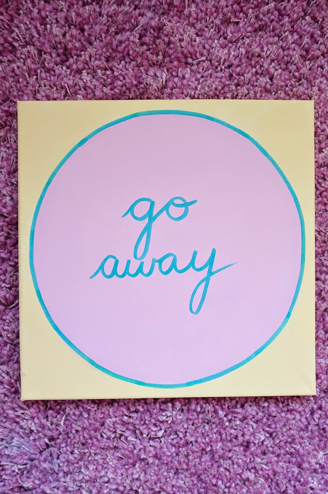
Feminist slogan underwear, by Sami Cronk


Common themes in this kind of work include reinforcing the idea that women shouldn't have to wear nice underwear for men, and that tacky slogan clothing like that seen above does not give an accurate representation of women. It is also another reference to the fact that making clothes, sewing and embroidery are all seen as stereotypically "female" skills.


Wednesday, 19 February 2014

2nd fabric piece

My last fabric pieces were a subtle comment on women's position in society, and the way they can be used. Continuing to explore this idea in my next piece, I have once again used pink fabric as the stereotypical symbol of femininity, but I have used a bed sheet to create more connotations of "woman's work" (i.e. making beds, housework etc).


The folds and creases are also suggestive of female anatomy, as is the colour pink...

"According to surveys in Europe and the United States, pink, especially when combined with white or pale blue, is the colour most commonly associated with femininity, sensitivity, tenderness, childhood, and the romantic. However, when combined with violet or black, it is associated with eroticism and seduction"


Wednesday, 12 February 2014

Colour symbolism/association

As much of my own work (and the work of artists I have researched) is focused around a few central colours, I researched the meaning and symbolism behind them, and their associations.

Pink
  • primarily recognised as a "feminine" colour (in some countries like Japan it is a "masculine" colour - pink cherry blossoms = fallen warriors).
  • variations of pink can be stimulating (fuschia/magenta) or calming (baby pink/peachy pink).
  • associated with love and romance.
  • regardless of your skin tone, some part of your body will be pink (tongue, fingertips etc).
  • according to Jean Heifetz, for centuries, all European children were dressed in blue because the colour was associated with the Virgin Mary. The use of pink and blue emerged at the turn of the century, the rule being pink for boys, blue for girls. Since pink was a stronger color it was best suited for boys; blue was more delicate and dainty and best for girls. 


Red
  • red is "the colour of extremes".
  • it can represent love, seduction, violence, danger, anger, and adventure.
  • prehistoric ancestors saw red as the colour of fire and blood – energy and primal life forces
  • red is one of the top two favourite colours of all people.
  • red is the international colour for stop.
  • red districts sell sex and pornography in every European culture.
  • the history of languages reveals that red is the first colour after black and white. (All languages have words for black and white. If a third hue exists, it is red.
  • red is the most popular colour used on flags in the world. Approximately 77% of all flags include red.
  • in Russia, the word for "red" means beautiful
  • red captures attention. It is one of the most visible colors, second only to yellow - which explains why it is used on fire engines and stop signs to trigger alertness


Tuesday, 11 February 2014

Manipulating fabric & colour

Whilst some artists manipulate fabric to turn it into something completely new (e.g. Emily Miller, Lin Tianmiao), others simply "rearrange" it in order to create implicit works. This is seen in Robert Morris's series of felt sculptures entitled "Vettii":


Despite the fact that they are simply pieces of coloured fabric hung up against a wall, there is something obviously sexual about the works. They work similarly to some of Georgia O'Keeffe's "flower paintings", which could be seen as literal flowers, or the metaphorical "flower" of the female body:


Morris's work is similar to other textile artists' work, in that the use of fabric rather than paint or pencil can convey more meaning and symbolism. Like the large pink fur sculptures of Emily Miller, Morris's hanging felt forms give a feeling of softness and femininity to the space. The colours used are also important - pink and brown are very "human" flesh like colours, as opposed to O'Keeffe's brightly coloured "flowers" which have a less obvious symbolic connotation.


Monday, 3 February 2014

Own work - textile/fabric pieces

My first piece of work for this project is largely inspired by the use of fabric seen in the work of Emily Miller, and also by Méret Oppenheim's "Object", which was nicknamed "Le Déjeuner en fourrure" by André Breton and is known in English as known in English as "Fur Breakfast" or "Breakfast in Fur"

With an underlying theme of femininity and an obvious sexual pun, the use of fur in the work carries the same connotations as Miller's "X Chromosomes" sculpture.

Oppenheim's "Object" ("Le Déjeuner en fourrure").


I chose to use similarly tactile fabric for my own work, as it carries connotations of femininity and softness, but decided to combine it with functionality and practicality (again, something seen as typically "male").


I chose to use fleece fur for its softness, and chose these colours because they are highly contrasting, and whilst pink is often associated with femininity, black is often seen as a more "masculine" colour. 

I made two large cushions, one pink with a red zip, and the other black with a pink zip. Textiles and fabrics are often seen as a craft and therefore a "woman's art", but these are also practical and can be used, rather than just being "something pretty" to look at. However the fact that they can be unzipped and used is also a subtle comment on how women can be treated in much the same way - as an object, something to be used by men.