Monday, 31 March 2014

Barbara Kruger

Barbara Kruger's photographic/typographic work features slogans that send a political or social message:

"Your body is a battleground"


"You are not yourself"


"Not stupid enough"


Kruger's use of celebrities in her work is something I find interesting, as often audiences are far more likely to pay attention to a familiar face. Her use of bold colour, type and wording engages the viewer immediately:

"Much of her text questions the viewer about feminism, consumerism, and individual autonomy and desire, although her black-and-white images are culled from the mainstream magazines that sell the very ideas she is disputing.
Kruger juxtaposes her imagery and text containing criticism of sexism and the circulation of power within cultures is a recurring motif in Kruger's work. The text in her works of the 1980s includes such phrases as "Your comfort is my silence" (1981), "You invest in the divinity of the masterpiece" (1982), and "I shop therefore I am" (1987). She has said that "I work with pictures and words because they have the ability to determine who we are and who we aren’t." A larger category that threads through her work is the appropriation and alteration of existing images. The importance of appropriation art in contemporary culture lay in its ability to play with preponderant imagistic and textual conventions: to mash up meanings and create new ones. Her poster for the 1989 Women's March on Washington in support of legal abortion included a woman's face bisected into positive and negative photographic reproductions, accompanied by the text "Your Body is a battleground."
Addressing issues of language and sign, Kruger has often been grouped with such feminist postmodern artists which she was interleaved by Jenny Holzer. Like Holzer, she uses the techniques of mass communication and advertising to explore gender and identity."


Wednesday, 26 March 2014

2nd "Love Hearts" piece

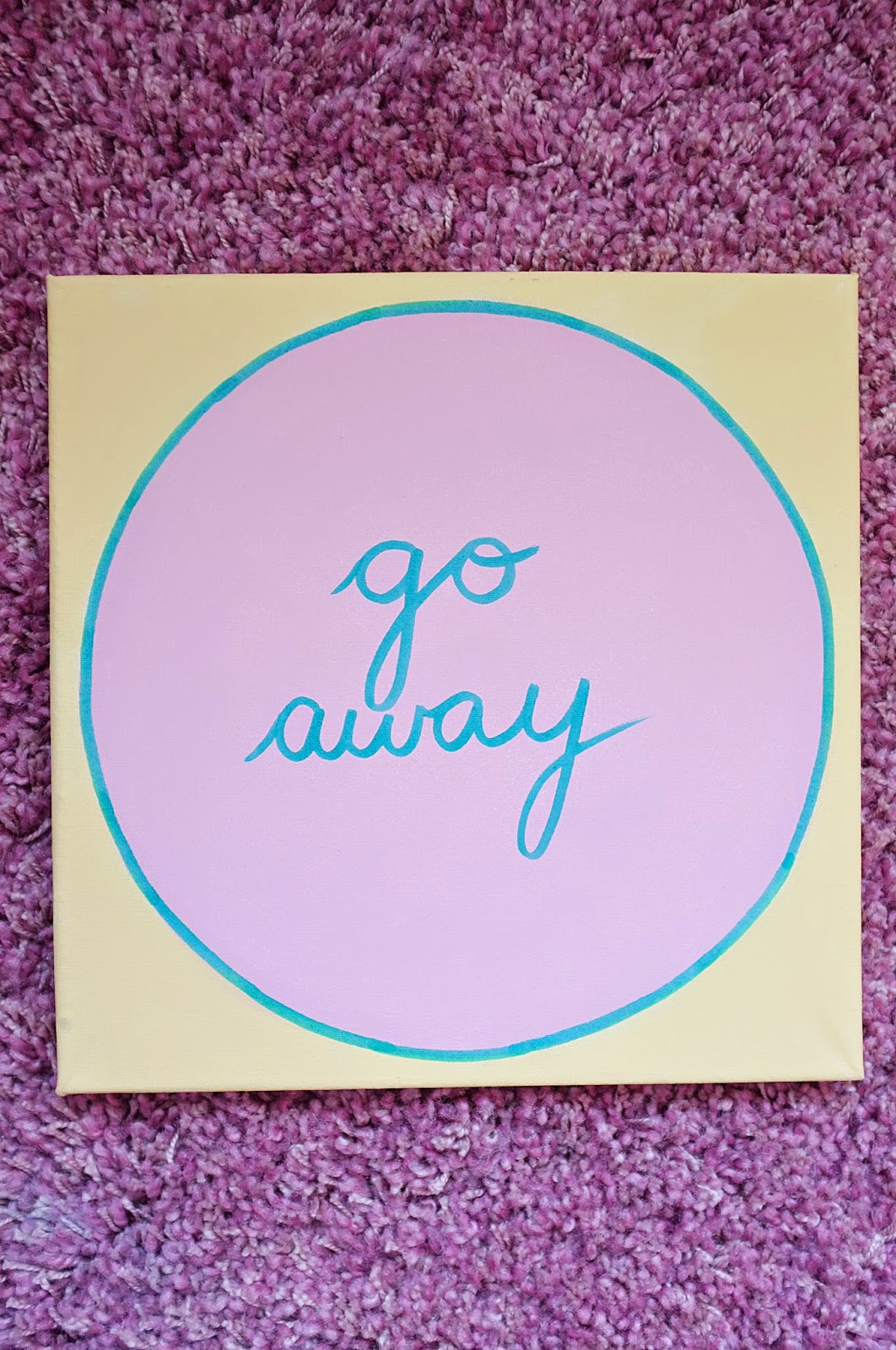
My second "Love Hearts" piece is a decorative wooden board, similar in style to those that are currently "on trend", but with a completely different message:


I chose to use pastel colours and the heart shape in keeping with my research into Love Hearts and colour theory, but like my slogan underwear, the messages are handwritten and the colour is hand painted.

This gives a "human" feel to a type of decoration that is often mass produced by machines and sold in bulk, but is in keeping with the vintage style of other decorations.

Thursday, 20 March 2014

"Love Hearts" slogan decoration

There is currently a trend for "vintage chic" home decor, with old-fashioned looking posters and other decorations becoming more and more popular. However, many of them are of a style that apparently epitomises vintage living, but actually glorifies the idea of "women's work" and shows women as being second rate, far more than is socially acceptable today:

"Laundry service" sign, eBay

"Sarcasm" apron, B&M

"Better rich" lap tray, B&M

"Definition of a girl" hanging sign, notonthehighstreet.com


Whilst these objects might be intended to be funny or "just a joke", many of them feature very sexist slogans.

Thursday, 13 March 2014

Slogans/"Love Hearts"

I chose to appropriate Love Hearts in my work, to make a comment about feminism and equality and how these kinds of objects are aimed at/about women. I painted a set of canvases in the same style as the sweets, but instead of being edible they can be used as decorations, in order to make a statement. They also feature sarcastic messages instead of the "cute", kitsch ones on the sweets:


Friday, 7 March 2014

"Love hearts" and slogans

Slogans are not just found on clothing, they are also used on many other objects to convey messages. Using "feminine" pastel colours in my slogan underwear pieces made me think of Love Hearts:


The iconic sweets are also various pastel colours, and feature slogans printed on them:

"There are many different messages which can be found on the front of the sweet, most of which are love-related. The message is written in capitals in a sans serif font of varying size. The font is scaled and sometimes stretched out of proportion to fit the available space.
The clarity of the messages is sometimes compromised, as the sweets are of a somewhat crumbly consistency and are prone to chipping. This often removes small sections of the red highlight or small sections of letters, making some messages difficult to read. Some of the longer messages (with the smaller fonts) are also prone to flooding with the red highlight."

Each sweet is a different colour: white, yellow, green, orange, purple or red. All the shades are muted pastel colours, seemingly aimed at girls and women. The fact that they are edible carries connotations with consumerism and "using objects", just as women are often viewed as little more than "something to be used".

The slogans include "cute" messages such as "All Yours", "Tease Me" and "Lucky Day" - many of them are similar to the ones found on slogan underwear and other clothing. Several of them have a very kitsch undertone, reflecting stereotypical views that women should be submissive and compliant.

Saturday, 1 March 2014

3rd fabric piece: slogan underwear

My third piece of fabric work is influenced by the feminist artists/textile artists I have researched so far. The set of 3 pairs of women's underwear is a comment on existing mass-produced, mass-marketed clothing, and the message it gives out to not only the women and girls who buy it, but any man who sees it.

Initially I sampled different colours and texts:


I decided to make the text more "stereotypically feminine" rather than using "masculine" block letters:


In contrast to the mass-produced underwear seen in shops, these are handwritten messages on ordinary, plain garments, reflecting the need to "de-sexualise" such clothing, make it less provocative, less mass-marketed, and less available to impressionable young people.